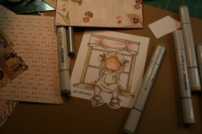
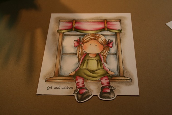
Hi… today I want to just post a few snap shots I took while I was working on a image. I am aware the photo quality is poor and I really did not spent any time getting the photos lighter.. I was not intending to actually write a coloring tutorial.
The process of this specific image was a bit different, so I would just like to share a few thoughts or remarks on it.
The images you see are by Hanglar Stanglar.. the focal point image is going to be very large – therefore I had to choose a patterned paper that gives me on very small areas enough colors so I can tie them in together with my image. I liked with this image along with the “Get Well” sentiment a rather vintage look. The pad I decided on is a old one from Basic Grey called “Sugared”

Usually I would start with the face and move from there on clothes, hair etc. etc...if I have a larger image I want to make sure that I distribute my colors in the right spots – by example the pinks… what happened to me in the past was that I would neatly color a image in.. just to notice at the end when it came to the last few areas that I ran out of colors or the balance was not even.
Most of the time I think you will be told that Copic ink needs to be wet in order to be blended out. This is of course correct, I have found … if I just lay one shade of my medium colors onto the image – it gives me an idea if the areas with the colors work together and I can still move on adding my shades. It does take time and work but it will be smooth and there are not going to be harsh lines.
I always color the face in first, it is just the start for me and it helps my eye to get used to the image and the vision I have of my image. Next I colored the frame of the window in brown – still leaving lots of white space. The inside of the window frame became grey.. from there I went to the shoes, I wanted them to be grey as well.
I decided on a piece of Design paper to see where the colors of my pattern would be.
From there I decided that the curtain needed to be pink (large area), trim in green and than small areas like socks, bows and shirt pink as well. Since the large area on the curtain was pink, the next larger area is the dress and I would need to be the second dominant contrast color. Hope this makes sense? To this point I did really not spent much time on the coloring process… it is just laying colors down to see if I like it, i would not mind at this point to start all over again.

Next you see a little more color come to the image. I like to color with the YG91 range however.. there are not the colors available that I would love to have so it takes me a bit to blend those colors out. Usually what I have to do is add deeper or richer colors to my other areas.. as you can see the balance on the curtain does not fit quite right with the greens. The green is too heavy. Window frame, wood.. has not depth to this point.. Just added a few shades of browns to the hair.

a little bit more blended moving on to add more colors to shoes, curtain etc.. I let the ink dry in between and just carefully add more color over it with a light hand.

Still not finished…adding my background to the image.. the wall in French Grey and the Window in Slate Grey. Now that I have all my colors on my image I can see where the image needs more color or depth. Adding the backgrounds to my images PRIOR to working on my shades on clothes makes a big difference for me. It just helps me personally to find the balance of each colored area – sometimes I might used a too dark background and I need to adjust all over the image again and make it darker, so it works over all.

On my finished card you will see that I worked with greys, black and darker pinks to create my shadows and folds – I went much darker around her legs and on the window bench.. her hair becomes more shades of brown and the folds on her bows get defined.
Here are the colors I used on this image:
Face: E000/000/00/13/R21 (Henna)
Greens: YG91 I always use this color for the first base moving up to 93/97/ W5 blending with YG0000
pinks: R81 blending with RV000 adding R85 blending with R81 and RV 0000 – it is a constant progress of adding colors and keep blending it out to create the folds
Window: First base is E31 adding E34/33
Hair : E50/ E37/25 black
shoes and window: W2/3/5/6/7/ 8 E44/42
accents on curtain: Y23/E99
Multi pen in 0.1 to connect lines after masking, white gel pen,

19 comments:
Hi sweetie and I'm sorry that I haven't even been here to wish you a happy new year! So all the best to you and yours for 2012.
It was great to read about your colouring process, always wonderful to see how an artist goes about it. Do you have that click moment when it looks right and you know you've finished?
I love your card and the sweet image and such beautiful colouring as always.
Big hugs,
Chris x
Ohhhhhhh....fantastisch, Claudi...dass muss Ich mal studieren!
Claudia-
I am sorry as I have not been on some time. This is just beautiful as always.
heiid
wow that came together beautifully. Thanks for sharing.
hugs Bonnie
Beautiful colouring and a great tutorial thanks for sharing Chanelle xxx
Gorgeous colouring Claudia! Thanks for showing a step by step tut!
Sheree
HI Claudia,
Oh my, this is just fantastic. Just love the step by step coloring. Last week i had a workshop from your friend Nicole with the flexmarkers, i still have a lot of practice to do, but i will know that i will try this too.
Hugs, Yvon
Thank you for this tutorial, I always love the way you color the images!
Have a nice weekend!
Hugs Thea
Thanks for sharing your colouring process...it's fascinating to see how you build the colours and shading on your image. Your work always inspires me and I'm sure that there is many a crafter who would love to be half as talented as you! (Including myself!) Hugs, Lisa x
So beautiful!
greetings
Monique
Thank you for this tutorial, it's really good.
Hugs
Chris x
Great job with the tutorial Claudia. Always always look at your work every day even if I don't get to leave a comment. Your work always inspires me. thanks so much!
Peggy
Wat geweldig ingekleurd
Groetjes
Hi, Your colouring is amazing and your card is gorgeous:) Sandra H
wow great coloring, thanks for the tutorial!
What a great tutorial, Claudia, with some wonderful helpful tips. The coloring is so beautiful and your shading is fantastic.
Thank you so much for sharing your expertise with us, it's so greatly appreciated so we can learn.......
Claudia how do you do the shading around the outside of the window?
Your coloring is so nice. I am just learning to color with the copics. I tried in the past with regular markers but it always looked like a preschooler did it. LOL I am doing better with the copics but I will be greatful to be even half as good as you.
Thank, Vicki
I really like to color system in the papers and drawings.There are many different type of drawing i can draw and fill the attractive colors in it.
Thank you for sharing your colouring process. I have always admired how you colour the images used, thank you for listing colours used, i find this very helpful to me. so i can give the colour combos a try for myself. As i get stuck as to what colours to use.
klare
:O)
x
Post a Comment